Painting as Performance (a remix)

More and more I think the context of a work is critical to its reception. I don't think painters in particular consider context enough. They deny the installation aspect of all artwork. It's something I've been thinking about since a class I took at OCAD (Improvisational Music and Visual Arts), reading about performance and improvisation. If we consider all artwork to fundamentally be a performance for the viewer, something that occurs in time and changes with each viewing experience, maybe it would change the way we approach our work - and the viewer. It's hard to think of any final art object (whether a static work like painting or a dynamic work like video) as an ever-evolving work, but more and more I am coming to believe that. It's why I aspire to create ever more complex works - the one-liners just don't seem to have the same shelf life - like the difference between performing a three-act play every night vs. repeating one well-crafted line.

If the context of viewing becomes an unavoidable part of a work's performance, do we then have to consider how to get more control over the viewer's reception of a work, or do we embrace the ever-changing nature of each viewer's experience? Now that an artwork can be seen in so many different contexts, in so many different incarnations, it seems inevitable that the artist has to relinquish control of any kind of "pure" reception of his vision. But just because this is inevitable, is this necessarily a good thing?

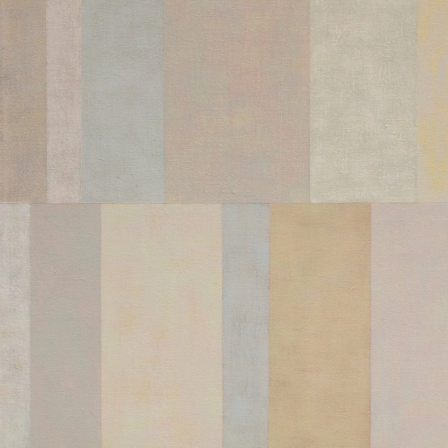
"Slow Art"

I recently came across a description of a graduate seminar offered by Christina Bertoni at RISD called "Slow Gaze" that I LOVE. It begins with this great quote:
"What we need more of is slow art: art that holds time as a vase holds water: art that grows out of modes of perception and making whose skill and doggedness make you think and feel; art that isn't merely sensational, that doesn't get its message across in ten seconds, that isn't falsely iconic, that hooks onto something deep-running in our natures." Robert Hughes at the Royal Academy Annual Dinner, June 2004.

Some of the course description:
"[...] In an institutional environment the pace accelerates with rapid and constant accumulation of information, stimulation, deadlines, feedback, production and presentation. Technology provides an array of simultaneous sensory experiences. There are other models of creative practice, which engage the prolonged gaze, reduced motion, slow accumulation of perception and experience, single focus. The [...] Slow Art movement challenges the frenzied pace of life and experience in the 21st century and promotes an attention to detail, ritual of production, [and] the inclusion of pleasure..."

Art is not for the faint of heart

It is probably fitting that I'm beginning my blog after just finishing a painting that I consider to be a massive disappointment. Let's face it - making art is torture most of the time. It all started out great - I was in love with the source image, my planned composition seemed intricate and interesting, and even the first layer of the painting turned out better than I expected:

Work in progress (by Amanda Clyne)

The added complexity was supposed to come from a series of overlays of impastoed paint - a technique I had tried on a series of small works:

"Ruffled", oil on canvas, 24" x 18", Amanda Clyne
"Corrupt Couture", oil on canvas, 24" x 18", Amanda Clyne
"Eyeing Power", oil on canvas, 24" x 18", Amanda Clyne

On this new work (it's 4' x 6' - pretty big), the overlays don't have the impact/effect I was hoping for.

Finished painting -- now in the trash heap...
At first, the marks were all too small for the scale of the work, and it started to look too picky and fussy. I began expanding the scale of the marks and vary the speed at which they were applied, and to that extent, I'm satisfied with the result. But the final aesthetic of the work is still not at all what I thought I was working toward. Perhaps the colors are too bright (the word "fun" comes to mind - and I definitely am not striving for works that are "fun"). Perhaps there's too much color variation, which takes away from the more sophisticated palette that lies beneath. Or perhaps the character of the overlays just don't suit the character of the initial layer. Perhaps the two styles need to be more integrated - instead of the materiality of the paint sitting on top of the photographic reference so distinctly, the photographic source and the painted medium should be made to merge more seamlessly.

Also, the fragmentation in the smaller works created more complexity in the final paintings and a much deeper sense of space. While I like the different stages of the collapsing image in the new work, I think it would have been much more interesting if the three versions had been fragmented and combined in a more layered way that offered a more complex sense of space and form.