 |
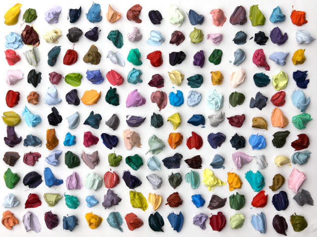
| The palette of 165 colors I mixed in my studio yesterday. |
As you can see, I have a new background image on my blog (and on my Twitter page too). I've been hating how boring all this white white white is, so I spent yesterday mixing a zillion colors and filling my palette with dollops of paint. I started out with a less ambitious plan in mind, just wanting to mix a few interesting colors that I could photograph, but as I started to see all those perfect drops of pureed color accumulate on the palette, I just had to keep going until it was at over-capacity. In the end, I mixed 165 colors (yes, that's right 165 -- 11 x 15 rows!!!), and I was adamant with myself that no two colors could be the same. They were all mixed from a basic palette of about five blues, three reds, three yellows, two whites and one green, mixed and mixed and mixed for hours on end. Needless to say, the last 60 colors or so were a little challenging to make identifiably unique, but trust me, I didn't cheat!! A little OCD, I admit. A weird obsessive tangent in my studio practice. But it became like a fun, sadistic, creative game that I had to finish. And lucky for me, I now have a palette stuffed with paint -- and several blank canvases await...
NOTE: For all the painters out there, my basic palette consisted of the following:
Blues: Cobalt, Ultramarine, Manganese, Cerulean, and Old Holland (and yes, that's a color by the brand of the same name).
Reds: Quinacridone Rose, Permanent Alizarin Crimson, Cadmium Red Light
Yellows: Hansa Yellow Light, Cadmium Yellow Light, Brilliant Yellow (another weird Old Holland brand color that I've recently started using)
Green: Permanent Green Light (Graham brand)
White: Zinc and Titanium