Resolution 2012

"At year’s end you should look back at your thoughts and opinions twelve months before and find them quaint. If not, you probably didn’t read or explore or work hard enough."
-- Chris Blattman


I want this year to bring a lot of change for me and my work, and this seems the perfect quote to launch this pursuit. Here are a few of the things I'm doing to get me started:
  •  Looking for ways to get out of Toronto for awhile. I'm currently in Europe withdrawal, but New York is never a bad idea, and I've even been thinking epic road trip too.
  • Working in other media. I particularly want to explore works on paper. I need to improve my drawing skills, and I'm dying to play around with inks and watercolors (could be wimpy, but I promise it won't be). Further experiments with photography are also on the horizon.
  • Finding inspiration in new sources. I've been pretty obsessed with the history of art this past year, and I'm ready to delve deeper into my interest in fashion as well as look for totally new sources of inspiration that I can't even imagine right now. Things could get crazy.
I'll return to this blog 12 months from now, and we'll see how far I've come.

De Kooning Debrief


I have no interest in writing a "review" of an exhibition I've seen. I'm not an art critic or art historian. My interest in seeing the works of other artists is as an artist myself. And as a painter, there are few artists that are more instructive or inspiring than Willem De Kooning.

Inspiration on Steroids

At the entrance to the exhibit was this portrait from 1943-44. I visited the show with my friend and fellow artist Nitasha McKnight, and as the two of us stood in front of this painting in awe unable to move, Nitasha said, "I get the feeling we are going to leave this show crying in pink." I think I already was. 


We were finally able to pry ourselves away from this portrait, but we found ourselves continually immobilized by almost every single painting. His complex, labored surfaces offer so much subtlety and depth, while the fluid drawn lines insert an intentionality and confidence that so elegantly evokes sexy, sensual forms. These forms are repeated throughout his oeuvre and begin to form a language that becomes evident as you patiently work your way through the exhibition. Of course De Kooning is known for his bold merging of figuration and abstraction, of figure and ground, but until I had the luxury of walking through the annals of his entire career in one day, I don't think I fully appreciated the continuities and linkages among his seemingly disparate bodies of work. But there they were, available for all to see if you could just spend enough time looking. And as we stalked our way through the different stages of his career, every leap seemed more understandable, more inspiring.

Half way through the show, Nitasha and I had to take a break. We had spent hours studying the first few rooms, and we hadn't even come to the Woman series yet. Our heads were ready to explode as we tried to memorize every stroke and sensation that lay before us in charcoal and paint, analyzing and grappling with each and every major and minor development we could glean. Our eyes were exhausted from having to accommodate the demands of his scrambled, anarchic but palpable spaces. And the endless array of marks and gestures, scrubbed surfaces and impastoed passages, frail glazes and fearless over-painting, we were consuming it all in a gluttonous visual feast. We needed some time to digest.

We went downstairs for a coffee and sat there for awhile in silence. Finally, we both confessed that the show was inspiring to the point of shaming. Our own practices suddenly looked timid and cautious. We had viewed barely one-half of the exhibition and yet we had seen enough breakthroughs for at least three careers. De Kooning was ambitious, brave, constantly pushing his ideas into new territory in ways that were risky and fearless, never harping on one idea for too long, incurably restless and rigorous in his pursuit. It is an incredibly inspiring - and humbling - model for an artist's career. Nitasha and I agreed, we will have to do better.

Hidden Gems

De Kooning's "Black Untitled", oil on canvas, 1948
For those of you who know me, you know that I am really interested in the genealogy of images, in the influence of past images on the making of new images. This painting ("Black Untitled") by De Kooning is not one of his more famous images, but I was completely smitten with it at the exhibition. When you first approach it, it looks like a strange process-based piece, a relatively inconsequential work that must have been a mere stepping stone toward the more iconic masterpieces like the black and white "Painting" from 1948. But this modest untitled work just wouldn't let me go, and the more I looked, the more I saw.


The photograph of the painting looks much more graphic that the real thing, of course. The painting has a ghostly quality that is eerily dramatic. The longer I looked, the more figural references I came to see, and the tension and angst it evoked brought other great black and white works to mind. Most obviously, it seemed to have a lot of similarities to Picasso's Guernica:

Picasso's "Guernica", 1937

And once I put De Kooning's work in the lineage of Guernica, it was impossible to not see the spectre of Goya's "Disasters of War" etchings (1810-1815).

Etchings by Goya from his "Disasters of War" series


Most of the visitors were only giving this modest De Kooning a cursory glance as they walked through the exhibit. And it certainly would never have been a painting that I would have paid that much attention to if I had only seen it in reproduction. But standing before the painted object, I was completely seduced. Offering it my time and contemplation, it more than rewarded my efforts. These were not painting of instant gratification. Thankfully, Nitasha and I had the time to revel in each work, and the rewards would grow exponentially as we continued our epic trek through De Kooning's career.

Die Hard

By the time Nitasha and I had worked our way through the Women series and later figurative works, our knees were beginning to buckle again. Feeling like exhausted prizefighters entering the ninth round of a boxing match against the world champion, we took a moment to breathe deeply, trying to reinvigorate ourselves. We had to shake off the latest visual onslaught so we could brace ourselves for the body blows that we were certain would come. And come they did.

In the next room, the paintings were hung so close together you could practically see the curators throwing up their hands in surrender, unable to edit even one of the brilliant works out of the tight line-up. But there were two paintings that captured our attention for the longest.

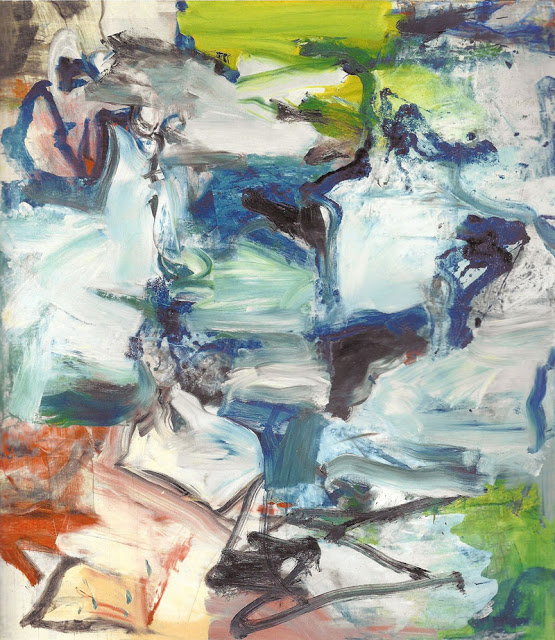
De Kooning, "Untitled", oil on canvas, 1977

 The first was "Untitled" from 1977, the watery blue painting with the red high-heeled shoe. In reproduction, it's hard to see what makes this painting so hypnotic. But in real life, it towers over you, the swaths of pale blue paint forming spaces that are positively pillowy, inviting you to dive in. The dark pthalo brushstrokes recede into delicate crevices, and the suggestions of surf, sand and sex is irresistable. As we walked around the room, I kept looking back at this painting, continually surprised by its visual depth and frothy surface. It wouldn't leave me alone.

The definitive punch that finally knocked us out was "Untitled III", also from 1977. Nitasha and I must have stood in front of this painting for almost half an hour, so long that we started to strategize ways we could pocket the 6 foot painting and run away with it forever.

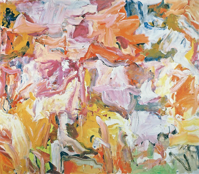
De Kooning, "Untitled III", oil on canvas, 1977

Among the million and one things that we loved about it was the crazy color choices he had made and how perfectly they played together. We had been noting his color choices throughout the exhibit. I have always associated a particular pink with De Kooning (a juicy pink made from cadmium red light), but despite all of his well-known fleshy hues, throughout the exhibition I couldn't stop remarking on his use of yellow in particular. Any painter will tell you that yellow is a tough color to use well and with subtlety. It can easily be neutered into Easter egg pastels, or poisoned with too much complimentary purple. With the tiniest bit of red, it can succumb to the pressures of orange. Or in an attempt to dim its blinding brightness, it can quickly become fatally drained of its fragile vitality. But De Kooning uses yellow masterfully, unpredictably, never making it come off as staid or cliche, often making it the life-giving artery of the picture.

And don't get me started on his enlightened use of greens.

When we came upon "Untitled III", we just stood there in amazement. At first glance, it's just bloody gorgeous, but as you try to imagine the process of making the work, the subtle and bold choices of color become curiouser and curiouser. Admittedly, De Kooning has his muddy moments, but they always seem to be alleviated by an unusual and inspired remedy. One could look at this painting forever. I certainly tried.

We stared at this painting for as long as we could, hoping that if we just looked long enough, we could absorb his spirit and later replicate his genius in our own work. But overhwelmed and slightly dazed, we finally had to leave. Ever since, as if the ghost of De Kooning himself were whispering in my ear, I keep hearing a voice in my head repeating over and over: be more brave. Get back to the studio and be more brave.


In The Flesh

I admit I am slightly tortured by the idea that 99% of the people who will see my work will not be seeing the real thing.  They will see it on a screen with different brightness and color settings than I see on my screen, and they will have to imagine how this little digital avatar might look in the flesh, so to speak.  And indeed, "in the flesh" seems the apt expression.  They will not see how the light reflects off the oily mushy paint strokes, how the color changes and shifts depending on whether the sun is beaming through the window or dimmed incandescent lights are quietly liberating it from the dark.  They will not see how big it is, how each face is larger than life size, how the painting stares at you as you wander around it, how the whole painting relates to their body.  They will not be able to look at it from different angles, from different distances, to move around the painting and experience the image collapsing into abstract details as they approach closer and closer.

Walter Benjamin described the work of art has having an "aura", and famously warned of the consequences of the future omnipotence of the reproduction.  California artist Robert Irwin never wanted his paintings to be photographed, since "Irwin felt that a photograph could capture none of what the painting was about and everything that it was not about.  That is, a photograph could convey image but not presence."*  For me, that seems true of all art that manifests itself as a physical object.  I heard Chuck Close say one time that the modern perspective of the history of art was not an examination of the history of painting but merely the history of slides -- frozen, stale reproductions, where all emphasis is given to image and little else.

One of the greatest compliments I can get for my work is, "it looks so much better in real life!".  I love having that experience myself -- of anticipating a particular experience with a work that I've seen online and then just being blown away when I get to see the actual work.  I had that visceral thrill most recently when I went to see Mark Grotjahn's spectacular exhibit in New York at Anton Kern this past summer.  Unreal.  So real.  Of course, too often, it can go the other way -- sadly, some paintings are much more impressive in reproduction.  I'll refrain from giving examples.

Here are a few different versions of one of my recent paintings ("Veiled", 48" x 28", oil on canvas).  Each image is "accurate" according to particular screens I have viewed them on.  I don't know what you see.  Each one of them is only an idea of the painting.  I wish it could be more.  I wish you could see the real thing -- in the flesh.


* From Lawrence Weschler's amazing book on Robert Irwin, "Seeing is Forgetting the Name of the Thing One Sees"

Passion as Purpose

"...having passion is just understanding what your purpose in life is." 
-- Dan McLaughlin

I came across this video today about this guy Dan who quit his job to prove that one can master any skill if they put in the requisite time, ie. 10,000 hours.  I remember reading about this 10,000 hour milestone to mastery in Malcolm Gladwell's book "Outliers", and I remember finding the idea reassuring after I crazily quit my lucrative job as a lawyer to try to be an artist.  If I just put in the time, it must be possible.  10,000 hours?  Then here goes nothing.

Well, it appears this guy Dan is documenting every hour of his efforts to master golf in a project called "The Dan Plan".  Perhaps I should have had more foresight and documented "The Amanda Plan" back at the beginning when I first quit my job.  And isn't the progression of learning art more interesting than learning golf?  I'm just saying.  Anyway, I relate to his story a lot, and I hope that his hypothesis that anyone can do anything if they just put in the time is true (for him as well as for me).  Although I sense a few glitches in his theory (everything doesn't just boil down to skill, does it?).

At the end of this video, the interviewer asks Dan whether the passion required to be so driven and focused so as to spend 10,000 hours on one endeavor might just be genetic.  I love his response:  
"How do you prove whether or not someone is born with passion?  I mean is that an innate ability or something that's actually, just for some unknown reason, some people are born with passion and some people are just passionless?  I don't really agree with that.  I think that as long as anybody finds whatever it is in life that they really love then they'll become obsessed and they'll just want to do that and nothing will get in their way.  So, perhaps having passion is just understanding what your purpose in life is."

Palette Madness

The palette of 165 colors I mixed in my studio yesterday.


As you can see, I have a new background image on my blog (and on my Twitter page too).  I've been hating how boring all this white white white is, so I spent yesterday mixing a zillion colors and filling my palette with dollops of paint.  I started out with a less ambitious plan in mind, just wanting to mix a few interesting colors that I could photograph, but as I started to see all those perfect drops of pureed color accumulate on the palette, I just had to keep going until it was at over-capacity.  In the end, I mixed 165 colors (yes, that's right 165 -- 11 x 15 rows!!!), and I was adamant with myself that no two colors could be the same.  They were all mixed from a basic palette of about five blues, three reds, three yellows, two whites and one green, mixed and mixed and mixed for hours on end.  Needless to say, the last 60 colors or so were a little challenging to make identifiably unique, but trust me, I didn't cheat!!  A little OCD, I admit.  A weird obsessive tangent in my studio practice.  But it became like a fun, sadistic, creative game that I had to finish.  And lucky for me, I now have a palette stuffed with paint -- and several blank canvases await...

NOTE:  For all the painters out there, my basic palette consisted of the following:

Blues:  Cobalt, Ultramarine, Manganese, Cerulean, and Old Holland (and yes, that's a color by the brand of the same name).

Reds:  Quinacridone Rose, Permanent Alizarin Crimson, Cadmium Red Light

Yellows:  Hansa Yellow Light, Cadmium Yellow Light, Brilliant Yellow (another weird Old Holland brand color that I've recently started using)

Green:  Permanent Green Light (Graham brand)

White:  Zinc and Titanium

Failure or Freedom

I couldn't do it.  I just couldn't come up with a final composition for my show.  I loved the idea of the symmetry of having three different paintings for each of three images.  I'm sure no one will care that the third image only has two painted interpretations, but for me it has felt like a failure that I couldn't come up with anything interesting enough to paint.  I came up with a lot of good compositions, but nothing that really said anything different than what I've already said.  It felt redundant, just another painting.  It felt like failure.

But after consulting with my gallerist (the unflappable Powell MacDougall), I was reassured that I had plenty of work for the show and to simply complete and perfect the works that were already in progress.  I began to think of all the things I could do without the burden of that one final painting to paint -- and suddenly I felt liberated.  I felt like a creative person again.  I realized how much that one painting was just feeling like product and not like art.  I didn't have the time to thoughtfully resolve a new compositional structure, so I was just trying to make a nice, reasonable painting to round out the show.  Ugh.  Terrible, soul-destroying motivation.

The first day after this decision, waiting for wet paintings to dry, I started playing with some old ideas that I haven't had time to revisit and explore.  In just a few hours, I felt on the verge of a new breakthrough. Instead of feeling the weight of having to execute an endless number of new paintings to meet painfully stressful deadlines, I felt excited, inspired, awake and rejuvenated.  I was an artist again, not just a painting machine.  And I might even have time to work this new idea into the show.  Now THAT''s exciting.

I know there is always going to be pressure to create work to fill shows on tight deadlines (at least I hope there will always be that pressure!), but now I realize how important it is for me to make sure I find a way to leave myself some breathing room -- some time to play, to ponder, to experiment.

I'm really proud of the works that will be on display at my show.  That final, failed, unpainted painting will not be missed.

All is Fair


"The only good thing you can say about an artist
is that they work hard."
-- Agnes Martin

I wanted to write about the art fair this week, provide some thoughtful feedback on the odd experience of both participating in and visiting an art fair as an artist (and it is unquestionably an odd experience).  But my mind is too focused on all the studio work that remains to be done before my show opens in just a few short weeks.  There is no time for reflection. 

"Split Screen", oil on canvas, 36" x 50", Amanda Clyne 2011


The fact is, I am struggling to resolve the final works for my show.  It was great to have my paintings displayed at Art Toronto, and there is no question that it was an opportunity to have more people see my work than would ever attend my exhibition at a gallery.  But I fear my show will seem woefully anticlimactic, since so many of my new paintings were just exhibited at the fair.  A few more paintings seem unavoidably necessary.

So I have been working frantically to complete a new series of three paintings, all derived from a new image.  The first painting is a little strange, but romantic and ethereal -- a mix of very wide and very narrow fragments that reads quite differently from my other works.  The second is a large close-up portrait, full of complex subtleties of tone and color, and although I am only half done, I should be able to complete it on time.  But it is the third one that is proving to be the killer.  I just can't seem to decide on the final composition.  I keep creating new possibilities, but am never quite satisfied.  I've come close a couple of times, even going so far as to build stretchers for certain compositions, but I just can't seem to bring myself to paint them.  

And I am running out of time.  The show feels lopsided without this elusive third work, so somehow I must come to a decision and begin painting.  But whenever I hear that voice in my head nagging me with doubt, I recoil and reluctantly force myself to start again.  I'm fighting for that moment when I look at the composition on my computer screen and I just can't wait to see it come alive in paint.  I'm fighting hard for this last one.  I better find the answer soon.


Mamma Mia!!!!

How much do I love Italy?  There are almost no words.  Just to see my work presented on the same page with the galloping, vowel-filled Italian language is simply heaven.  I have had the kindest responses from readers of the story in Italy, and I admit I spent much of the day yesterday speaking to my new roommate in my best Italian accent (all words sound better and more joyful with an Italian accent, don't you think?  Perhaps actual Italian lessons are in order).  After so many months of solitude in the studio, to have such a warm response to my work is so encouraging.  Hopefully this is a good omen for the reception of my work at this weekend's international art fair in Toronto.  Amo l'Italia!!!

A story about my work by Michele Caporosso for the Italian newspaper L'Espresso
October 25, 2011.

A Weird and Glorious Beast

This is a gorgeous review of my work recently posted on the amazing Flavorwire blog.  (Thank you Emily Temple!)


It comes just a day after I received coverage on the Artist A Day blog, which inspired a number of supportive comments:


It has been heartening to receive so much coverage lately by the blogosphere.  All I want is for people to see the work and for the work to find its audience.  But building an audience online is a strange process that often feels more like an old-fashioned popularity contest than a meaningful exchange of art and ideas.  It's so easy to become self-conscious about how many "fans" Like your facebook page, how many "friends" will comment on your posts (on blogs, Facebook, Google+, or seemingly endless new networks that I can't keep track of), how many followers you have on Twitter, or how many times your work is re-tweeted.  Some sites even rank which artists are most "popular" on their sites.   It is a never-ending tally of statistics and quantitative data that measures every eyeball that lands on your work, and publicizes every response (or lack thereof), grading your significance or "success".

Lately I have been struck by how much art seems to be merging with entertainment.  Galleries and museums compete with entertainment venues for their audience, and instant audience feedback is courted as a critical element to the "interactive" experience.  But this call for ranking and spontaneous judgement of work seems more suited to entertainment than art.  Is the painting a thumbs up or a thumbs down?  Should the work be given 5 stars or just 3?  Did you like it?  Did you have fun?  Throughout history, it has not always been the most popular artists who are the most significant or important.  Can the artist ranked #954th still find its way into history?  And is the #1 artist really "the best"?  Just because you don't "like" it, is not worth looking at again?

I admit that the thoughtful review of my work on Flavorwire and the longer comments posted on the Artist A Day blog are encouraging.  They indicate a real engagement by the digital crowd with the work, and as long as the comments are thoughtful and interesting, I love the feedback, good or bad.  I just hope art can sustain its place in the world as something to contemplate, to experience and to debate, and not just a momentary distraction to glance at, rank, and forget.